Salon du Livre de Trois-Rivières
Brand Proposal
Brand Proposal
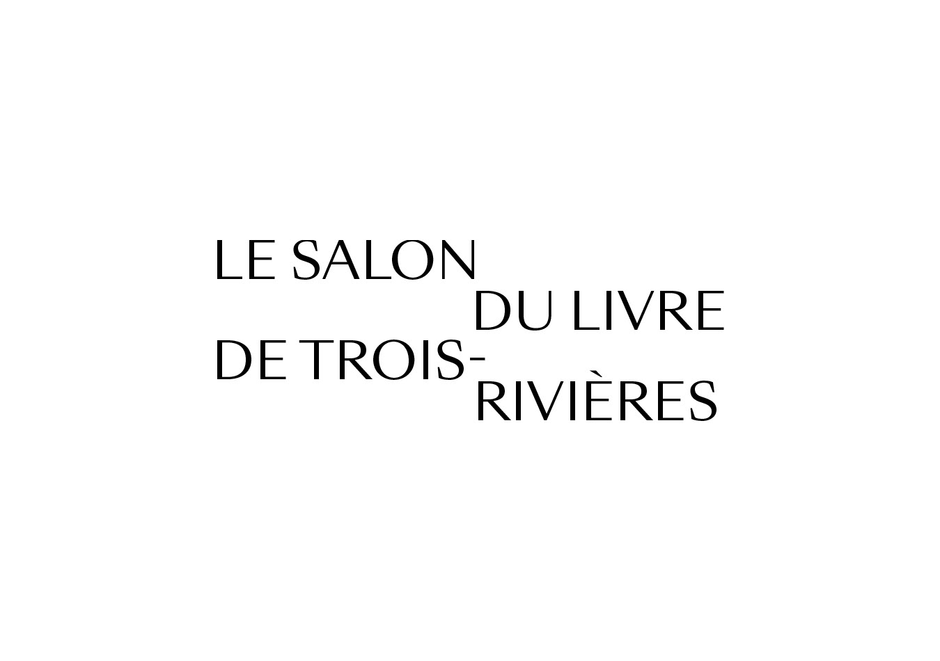
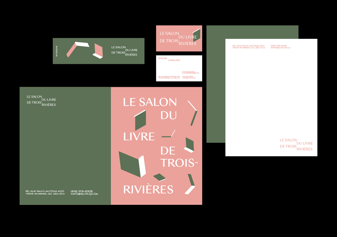
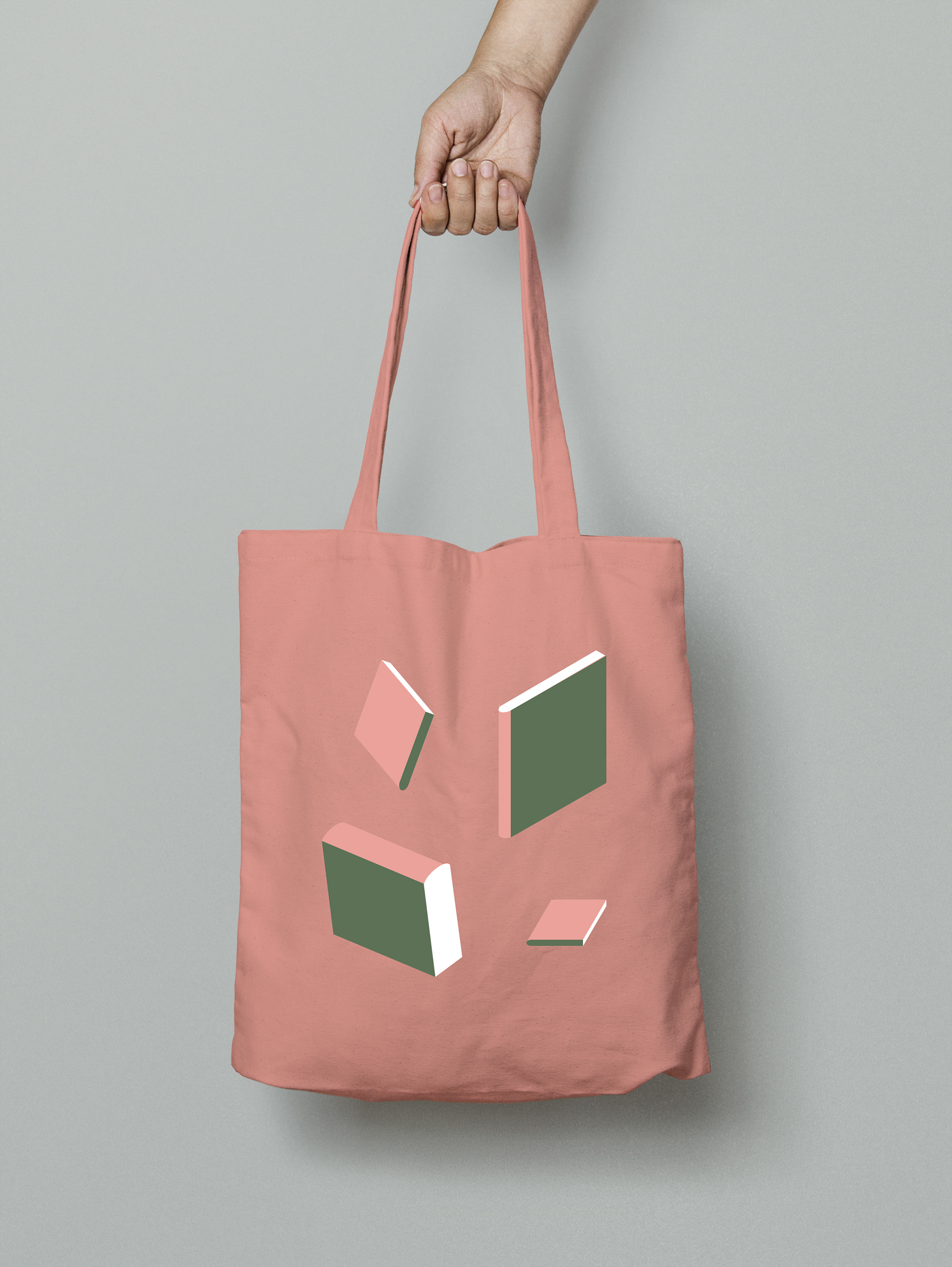
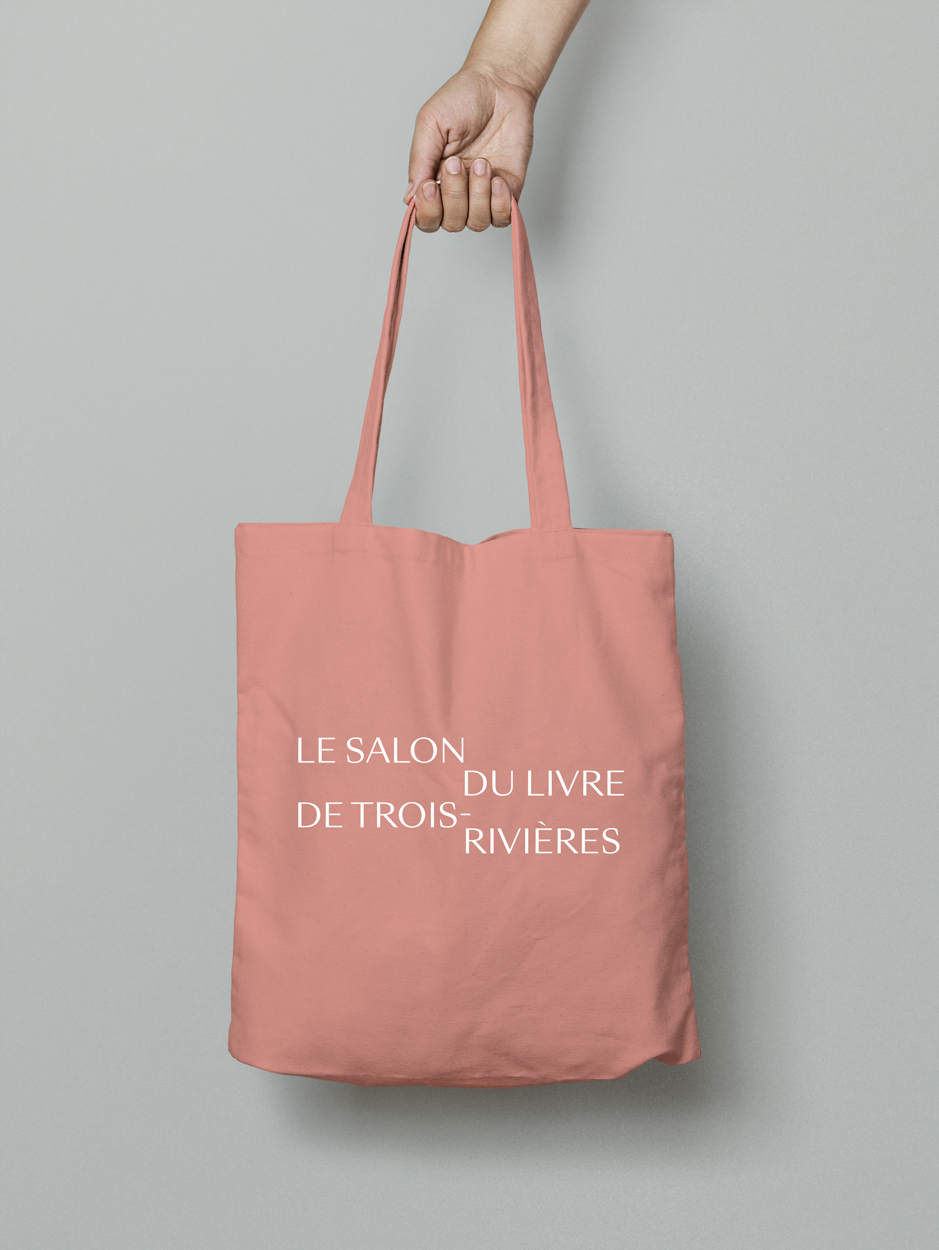
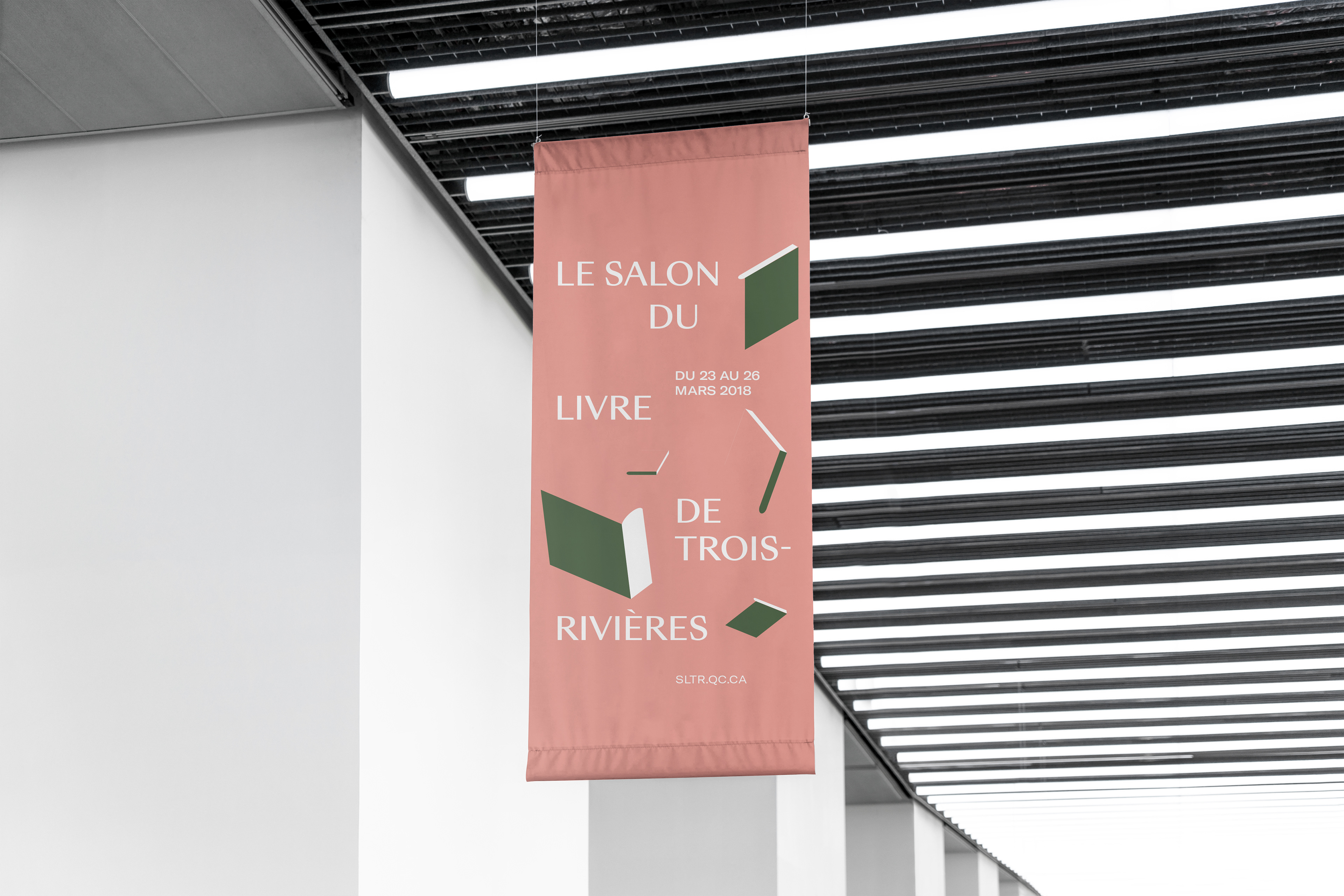
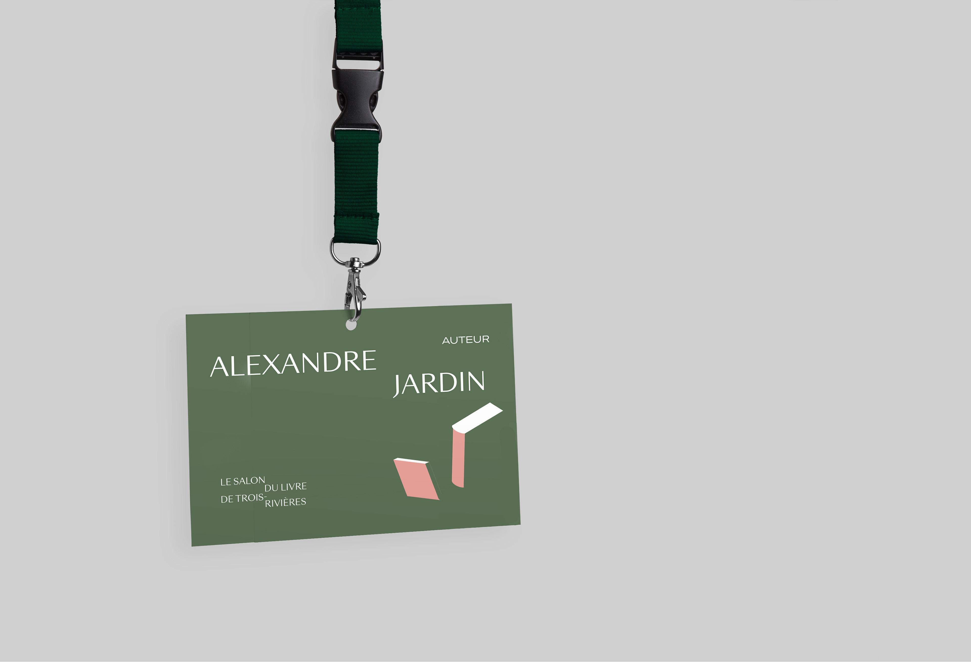
Dans le cadre d’un stage avec Par Hasard, j’ai eu l’opportunité de travailler sur la refonte de l’identité du Salon du livre de Trois-Rivières. Le logo que j’ai proposé, sobre et classique, rappelle une pile de livres par les espaces négatifs, comme plusieurs épines de couleurs différentes. La typographie humaniste rappelle les gestes d’une plume et apporte un côté plus distingué à la signature. Les illustrations amènent un côté plus ludique à l'univers graphique.
As part of an internship with Par Hasard, I had the opportunity to work on the rebrand of the Trois-Rivières Book Fair. The logo I proposed, sober and classic, is reminiscent of a stack of books through the negative spaces, like several spines of different colors. The humanist typography recalls the gestures of a pen and brings a more distinguished side to the signature. The illustrations bring a more playful side to the graphic ambiance.